Aveline.
Concepto de marca para una firma de moda de lujo ficticia de Barcelona — logo, paleta, video hero y una web con coverflow de cristal.
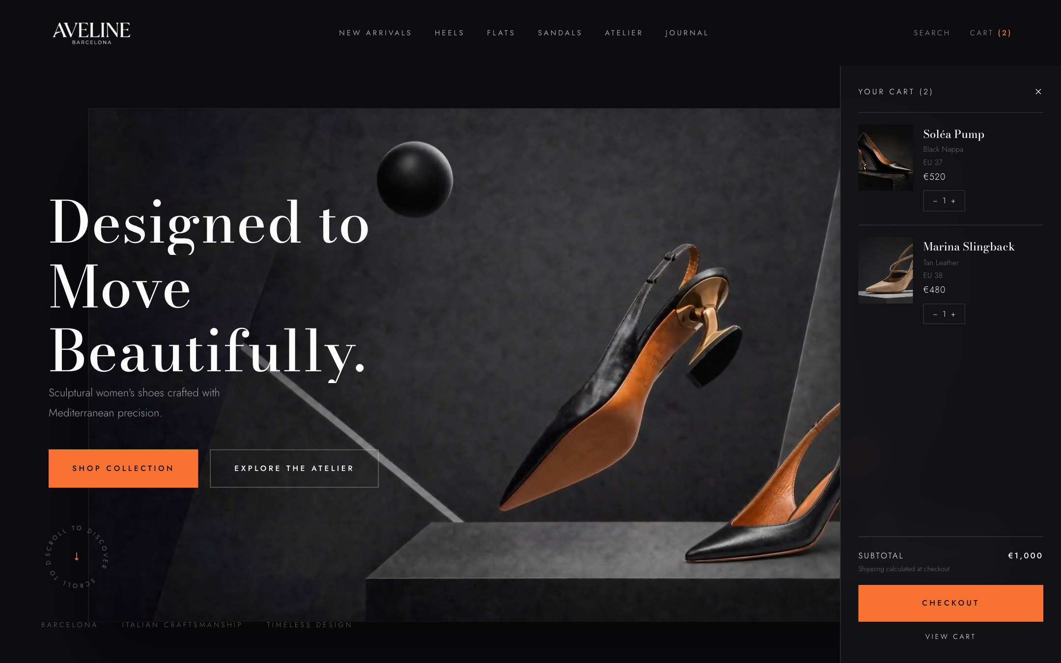
How do you stage shoes like sculptures? Aveline is a fictional luxury fashion label from Barcelona — and our concept study for editorial e-commerce: a Didone serif with attitude, graphite with a flash of safety orange, packaging with recognition and a website with a video stage and glass carousel.
Logo
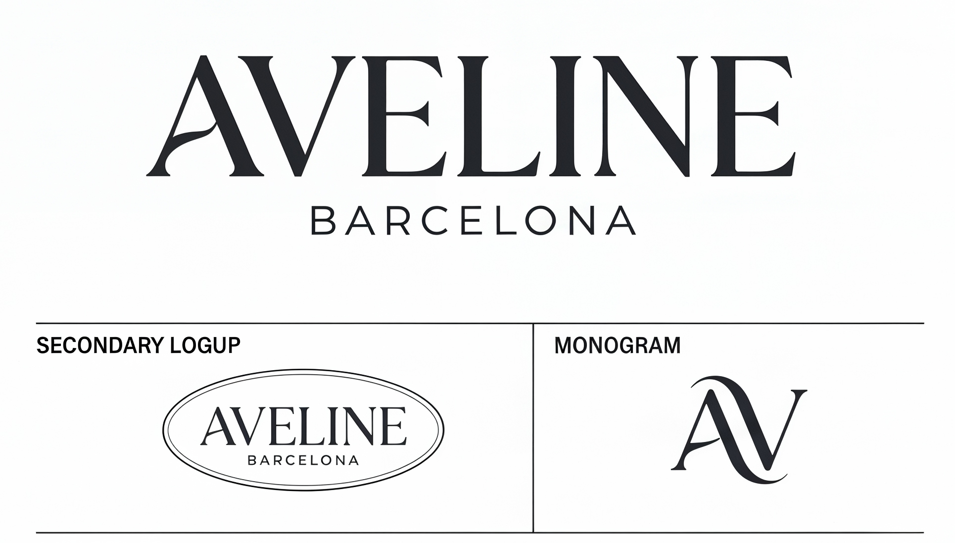
AVELINE in spaced serif caps with the Barcelona subline, plus the AV monogram for emboss, pattern and avatar — on kraft paper, boxes and in the campaign’s orange panel.
Palette
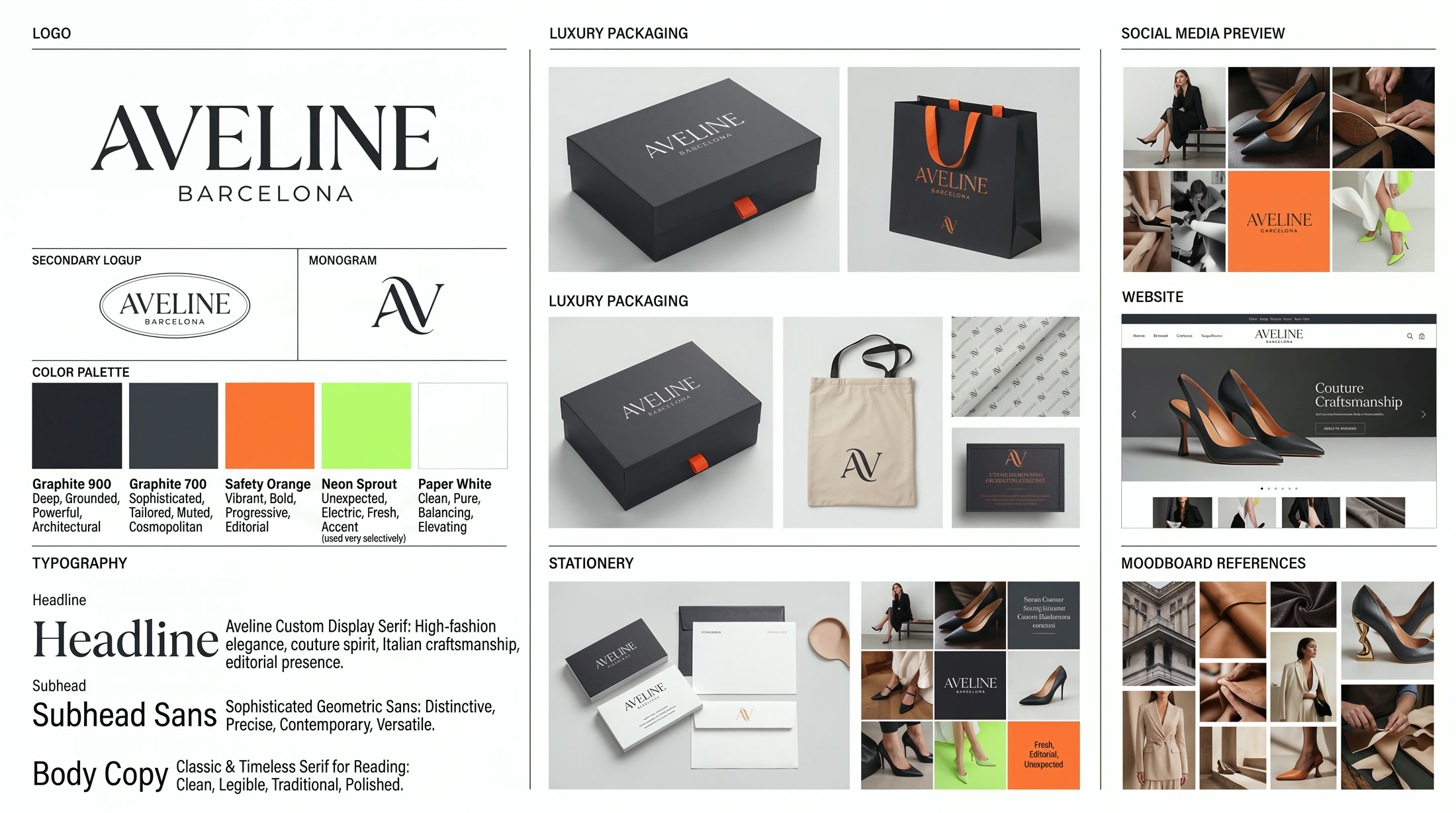
Two graphite tones carry the stage, Paper White keeps the typography clear — and Safety Orange sets the editorial accents. Neon Sprout stays the brand’s rarest signal, reserved for limited editions.
Typography
A high-fashion Didone for the big appearances, a geometric sans for navigation, prices and sizes — couture spirit meets precise interface.
For headlines, product names and campaigns.
For navigation, labels and interface.
Brand system
The complete identity board: logo lockups, palette, type roles, packaging, stationery and website preview at a glance.
Packaging
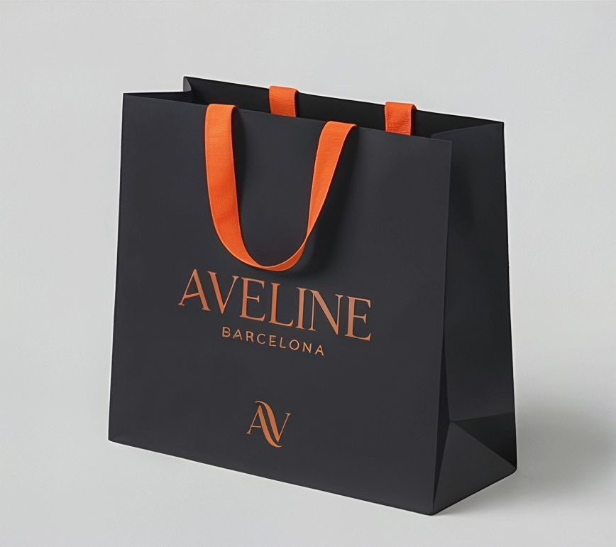
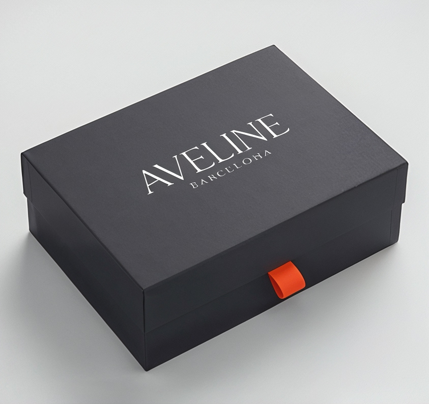
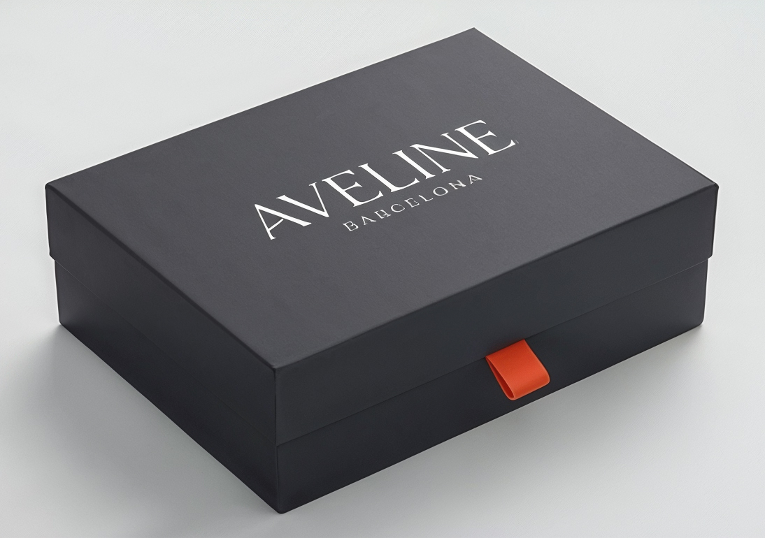
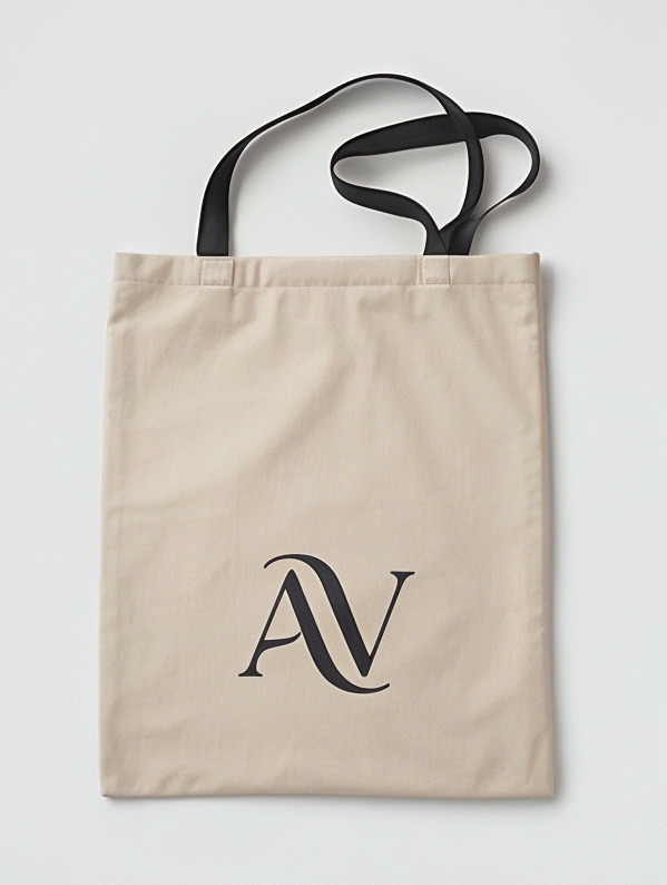
Signature black with orange handles and closure accents, AV tissue paper and a canvas bag — the unboxing is part of the staging.
Website
Editorial shop as a one-pager: video stage in the hero with boomerang loop and open cart, Featured Collection, the glass-card carousel with shifting perspective, product detail with size selection, campaign, unboxing and journal.

Social Media
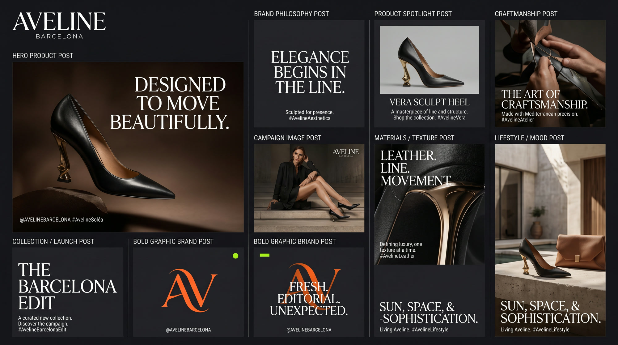
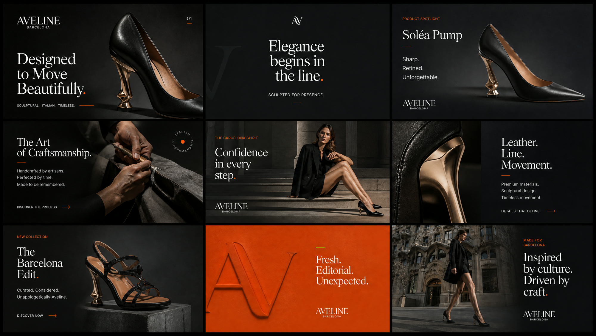
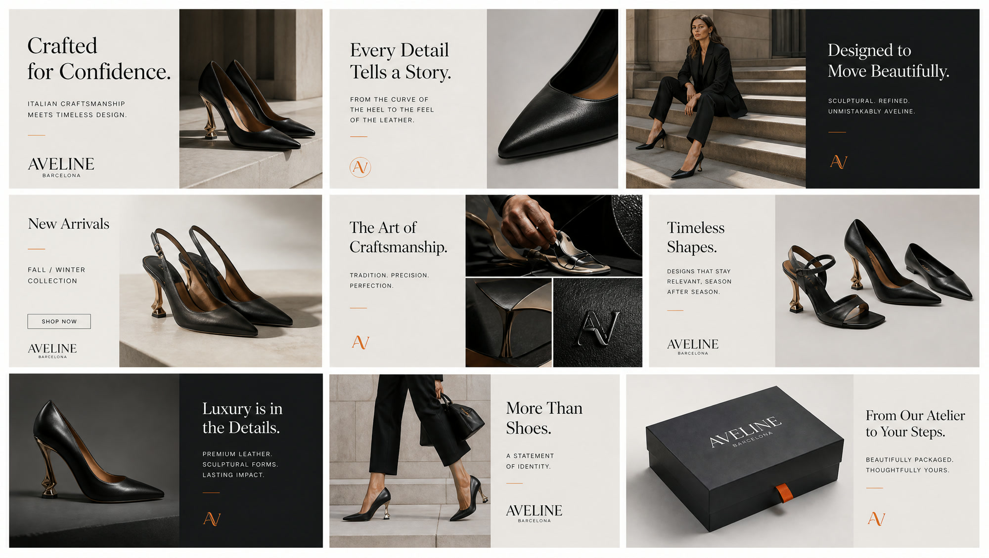
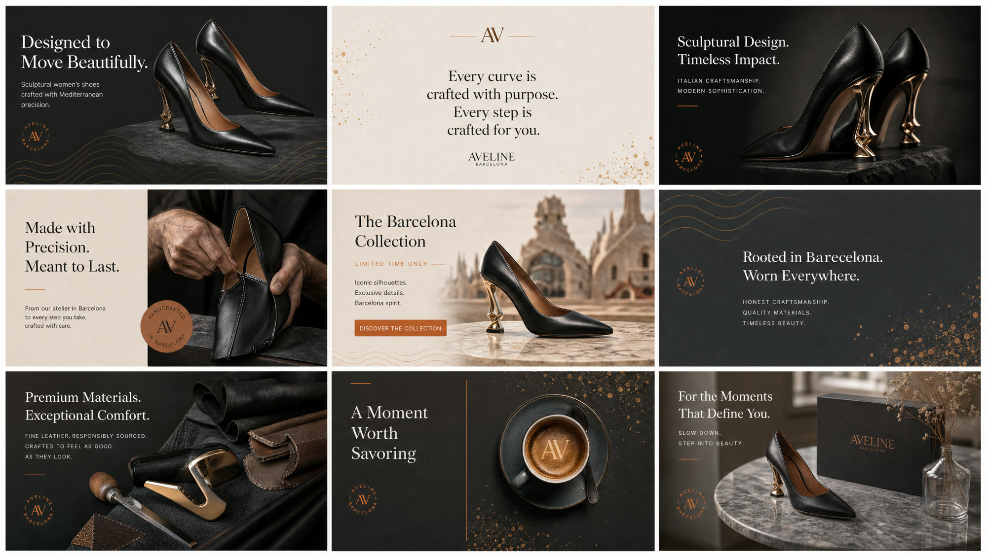
Four curated boards: two Instagram grids with product, campaign and Barcelona moments, plus two moodboards for visual language, type use and the orange dramaturgy in the feed.