Limmat & Crumb.
Concepto de marca completo para una panadería premium ficticia de Zúrich — logo, paleta, packaging, web y redes sociales.
How do you build a brand you can smell? Limmat & Crumb is a fictional premium bakery on Zürich’s Limmatquai — and our concept study for how we think about brands: from the mark through palette, packaging and social media to a website with scroll choreography. All of a piece.
Logo
A serif logo with the ampersand as a gesture, plus an icon mark: a muffin above the waves of the Limmat. It works as a seal, an emboss, a sticker and a profile picture — from the shop window to the avatar.
Palette
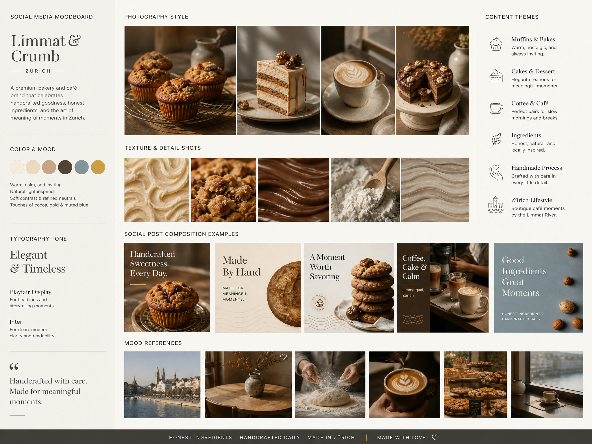
Warm, calm, earthy. Cream and Vanilla set the stage, Cocoa adds depth, Soft Gold is the refined accent — and Muted Blue recalls the river that gives the brand its name.
Typography
Playfair Display tells the story, Inter explains — an elegant serif for the big moments, a clear sans for everything functional.
For headlines and narrative moments.
For body text, menus and interface.
Packaging
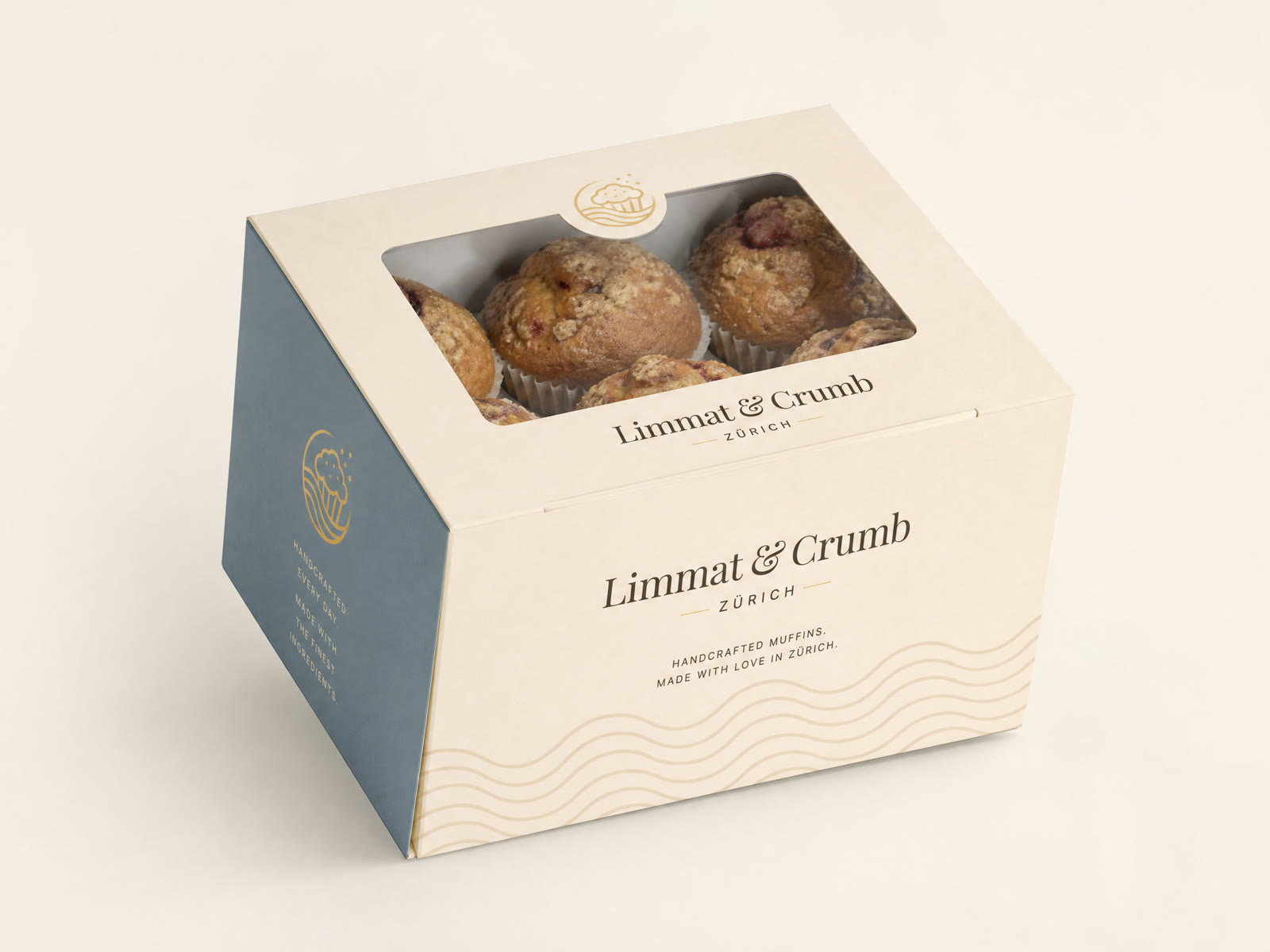
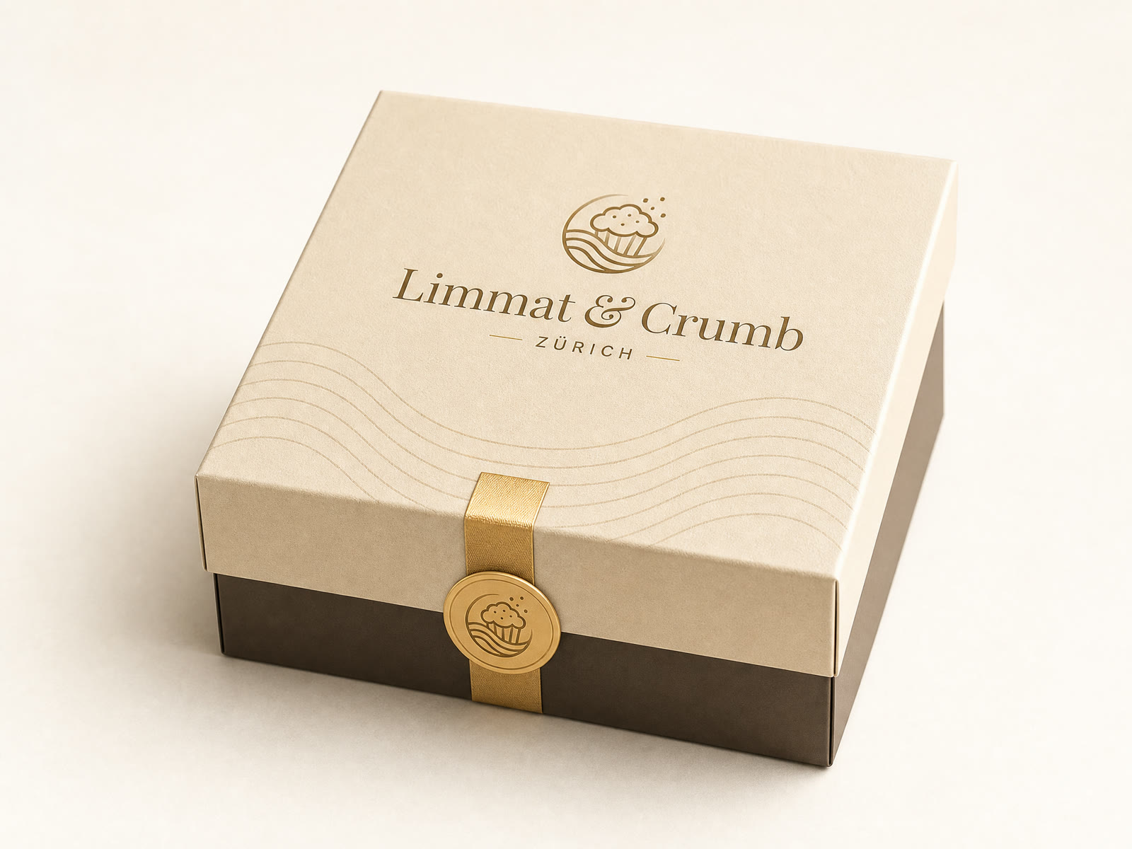
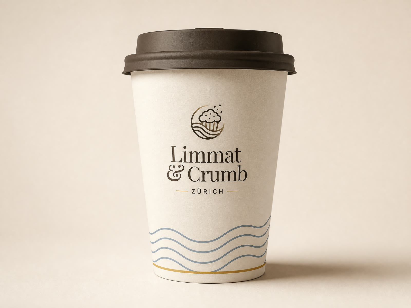
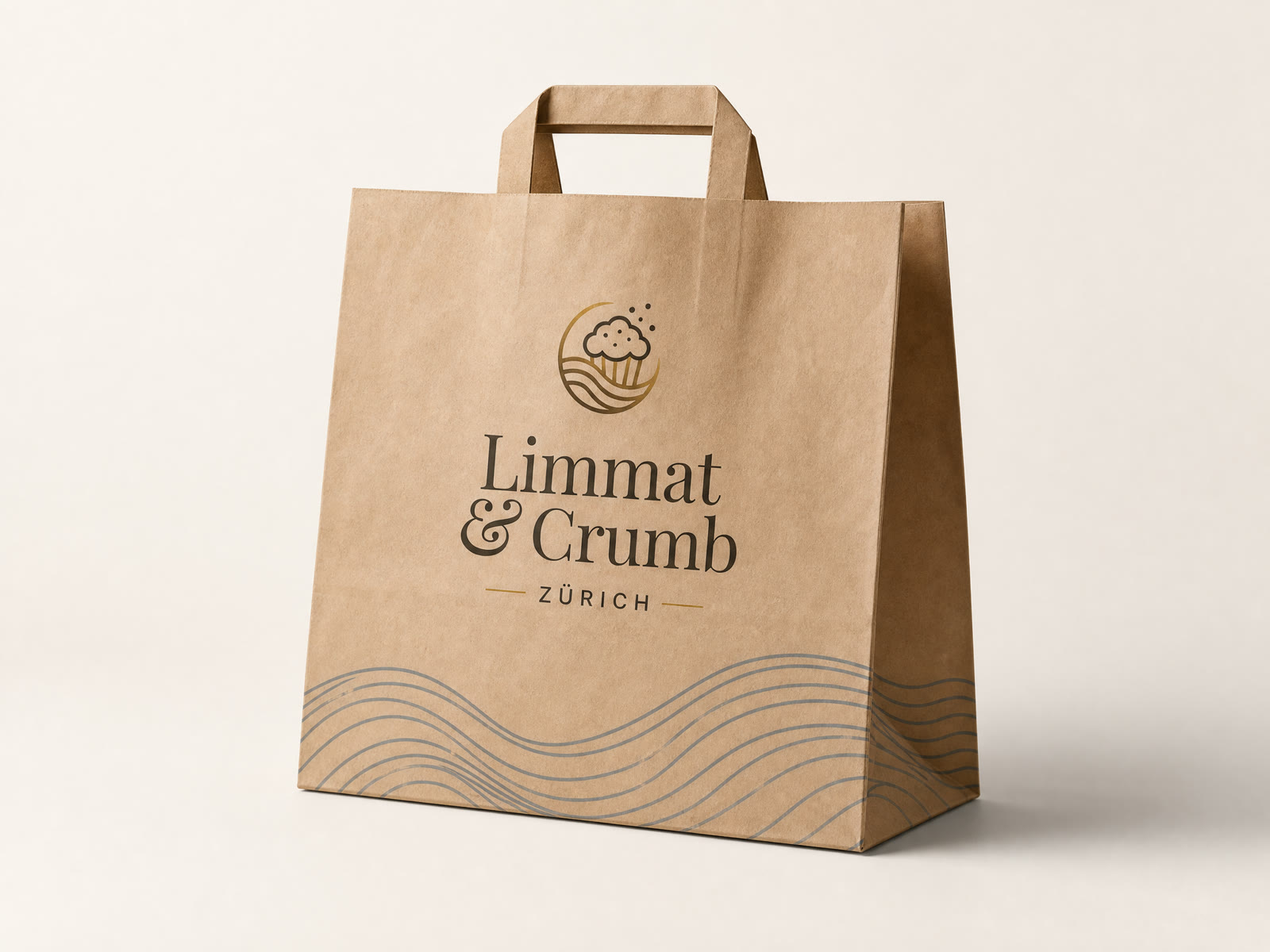
Muffin box, gift box with gold ribbon, coffee cup and paper bag — the Limmat waves run as an emboss through the whole series.
Website
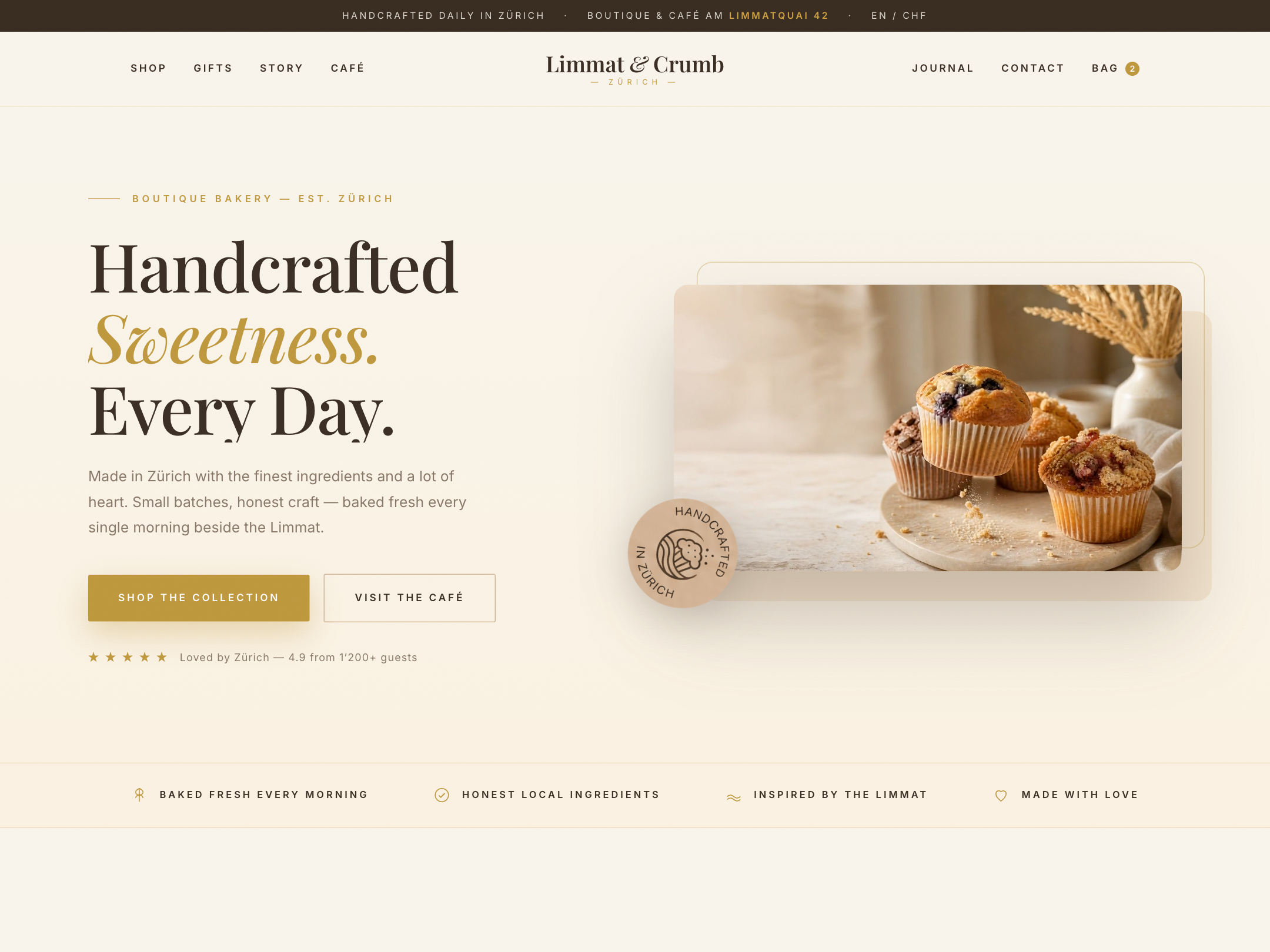
The centerpiece: a brand world of its own with hero video, parallax layers and scroll choreography — built as a full site with eight products, gifting, story, café and journal.

Social Media
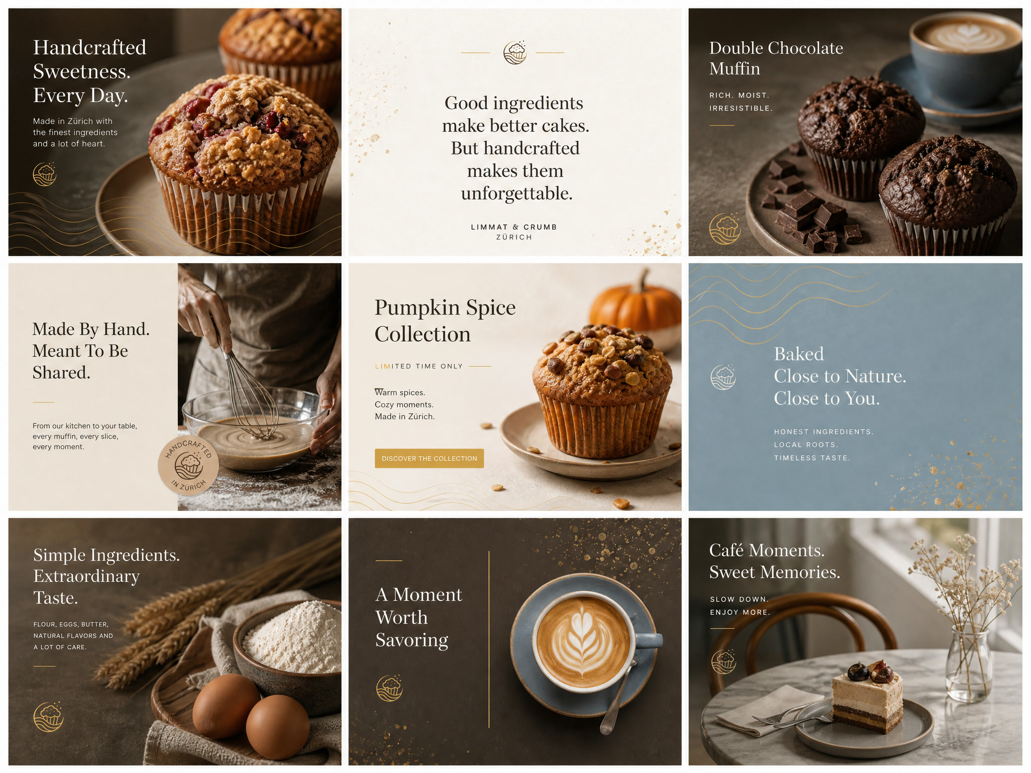
Three content pillars — product, craft, café moments — as a curated Instagram grid, plus a moodboard for photography style and tone.