RheinForm.
Concepto de marca quiet-luxury para un estudio de pilates premium ficticio en Basilea — oscuro, editorial, cinematográfico.
What does a brand that sells precision look like? RheinForm is a fictional premium pilates studio in Basel — and our concept study for quiet luxury: a mark with attitude, a dark, calm palette, refined applications and a website that feels like the studio itself.
Logo
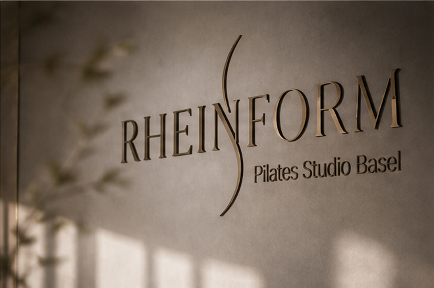
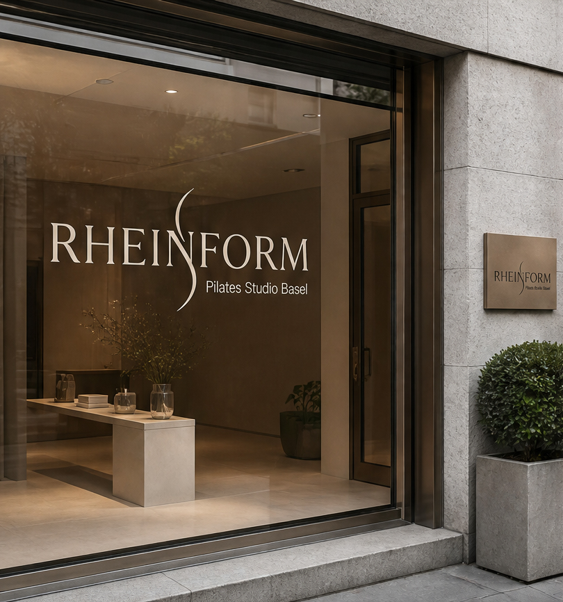
A Caslon serif in caps, threaded with the curved S — the line of the Rhine and the motion on the reformer at once. As brass lettering, the logo becomes architecture.
Palette
Dark, warm and very calm. Charcoal and Espresso carry the world, cream surfaces give it air, Bronze sets the few accents — Taupe and Sage ground everything in the studio’s materials.
Typography
Libre Caslon carries the big words, Inter the functional — the serif gives the brand its weight, the sans keeps booking and navigation precise.
For headlines and the big moments.
For body text, labels and interface.
Brand applications
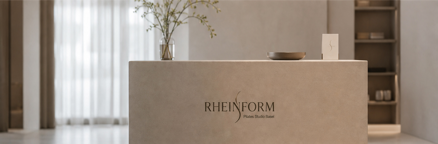
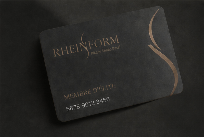
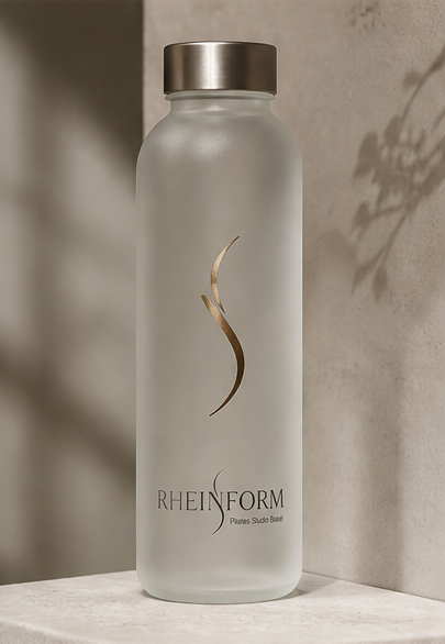
Shop window, reception, the black Élite membership card with gold emboss and the studio bottle — every application carries the S further.
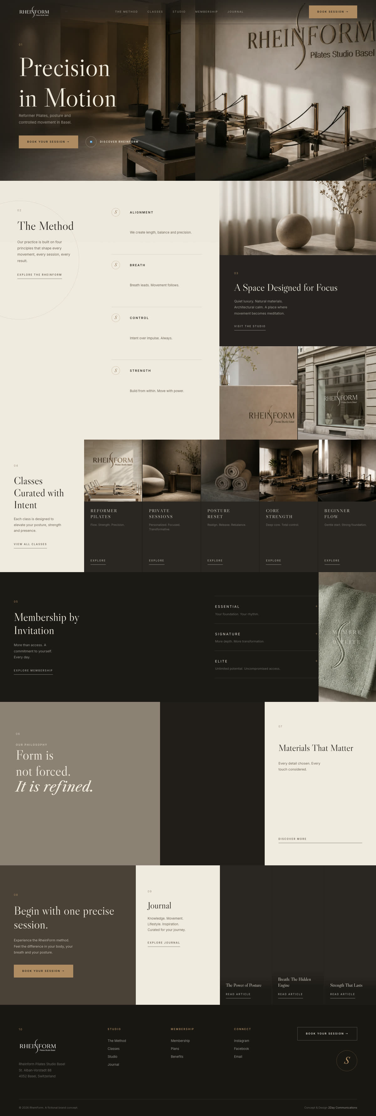
Website
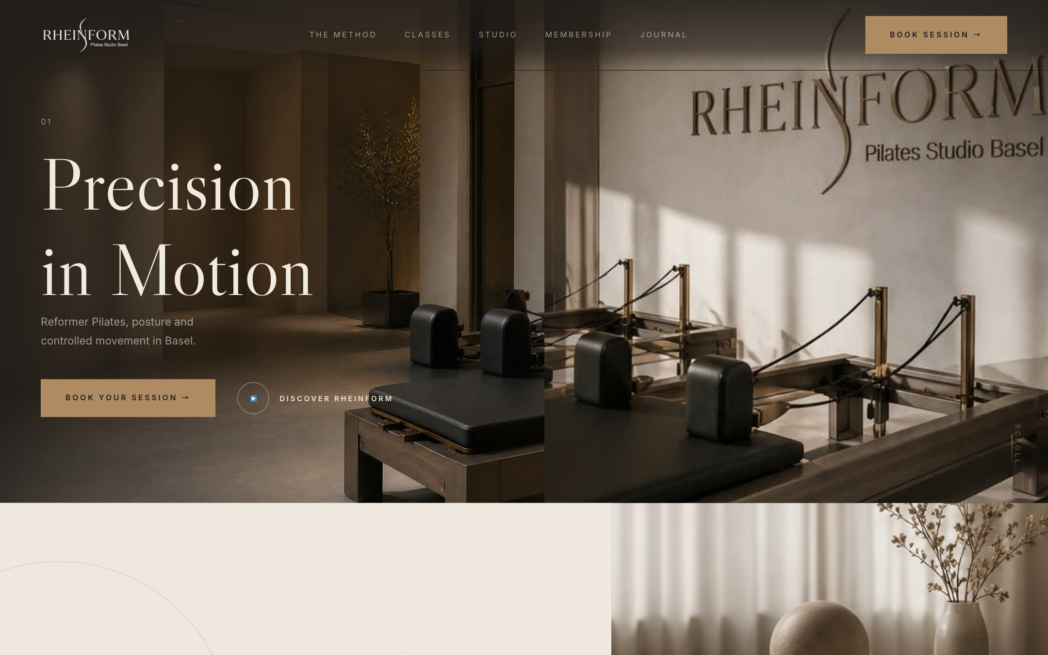
A dark one-page world with numbered dramaturgy: hero with brass wall, The Method, Studio, Classes, Membership by Invitation, philosophy quote and journal — with scrub parallax and calm block reveals.
Social Media
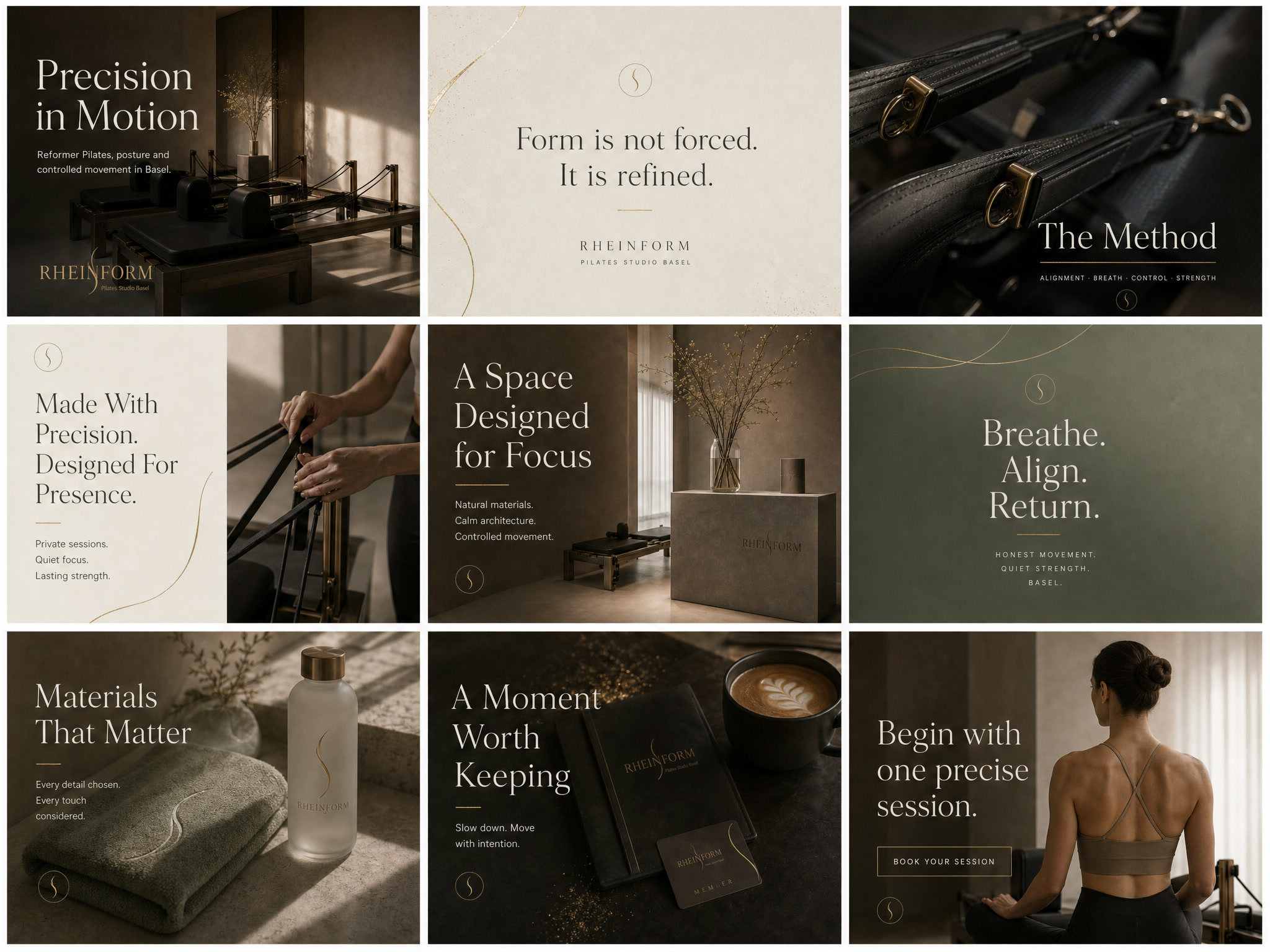
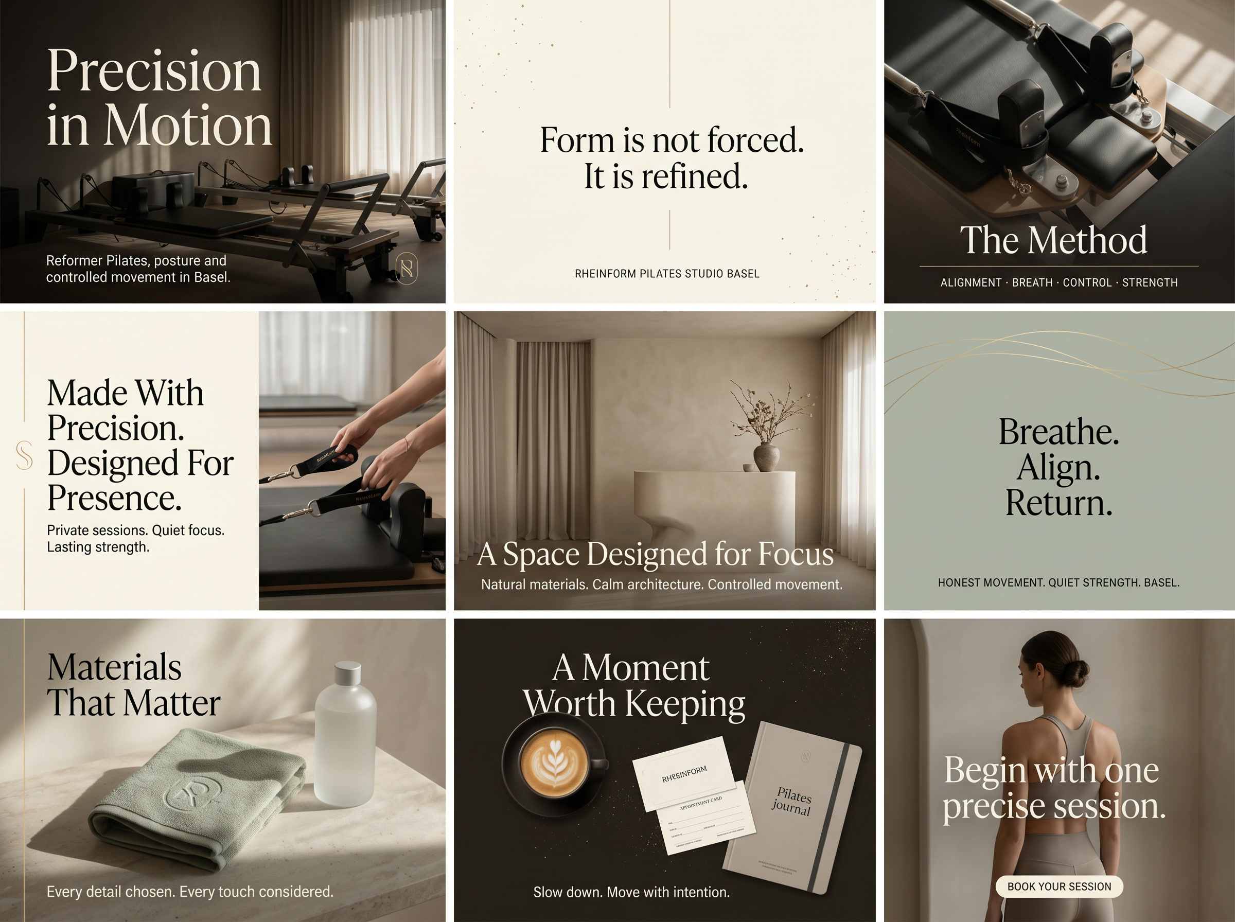
Two curated Instagram grids — studio moments, method quotes and material details in the same dark calm as the website.